Modernizing NRCS eDirectives:
From Legacy Interface to Clean Navigation
The Challenge
The NRCS Electronic Directives System (eDirectives) houses the policies and procedures that guide employees in delivering USDA programs, services, and resources to customers and partners.
The system was stuck in the early 2000s. Users faced a dated interface with broken functionality and a confusing category-based organization that made navigating directives difficult. The stakeholders wanted to reorganize everything by directive title and to bring the design into the modern era.
Timeline: Tight delivery constraints
My Role: UX/UI Designer and Researcher

The Transformation
Before: Legacy Interface Issues
Outdated visual design with dated color schemes and typography
Complex nested folder structure
Broken search and navigation features
Poor information hierarchy made content discovery difficult
Non-responsive design
After: Modern, Accessible Design
Clean, professional interface using US Web Design System (USWDS) components
Numerical organization by directive title for logical, sequential browsing
Streamlined left navigation
Responsive design
Enhanced search functionality
The Process
Research: Assess the Situation
Analyzed the legacy system to understand the full scope of the project. Through discussions with subject matter experts, I learned the category-based system was misaligned with user behavior. People needed to browse by directive title and view complete directives, not parts scattered across categories.
Ideation: Design with Standards
Created a complete redesign using the US Web Design System to ensure consistency with the broader NRCS digital ecosystem.
Design: Restructure Information Architecture
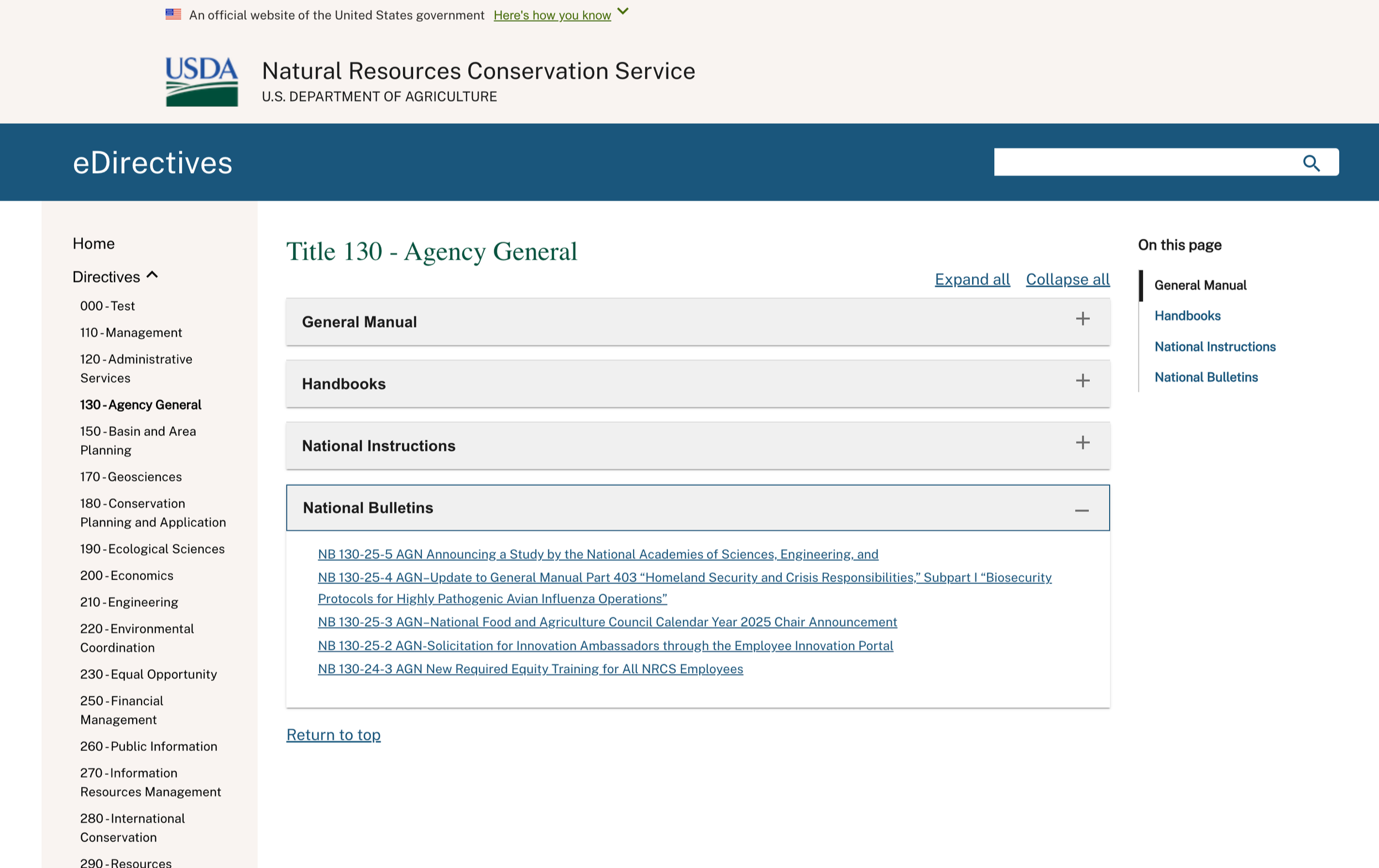
Reorganized the content structure from category-based to numerical by directive title, making it faster and easier for users to find what they need. Since viewing a directive and all of its categories and parts can be extremely lengthy, I included comprehensive navigation aids: accordions, in-page navigation, and buttons to expand or collapse all categories and return to top.
Testing: Collaborate Through Implementation
Worked closely with stakeholders, PMs, and the dev team throughout the build process to ensure the vision translated correctly to the final product. Gathered feedback and iterated on the design during development to address any usability concerns.
The Solution
Complete Visual Overhaul
Transformed the outdated interface into a clean, modern design using USWDS components that seamlessly integrates with the NRCS digital ecosystem.
Smart Information Architecture
Numerical organization by directive title for logical, sequential browsing
Streamlined left navigation with logical content groupings
Enhanced User Experience
Responsive design
Improved search functionality
In-page category navigation to assist when content gets lengthy
Accordion-style expandable sections for each directive type
Individual directive links within each expanded section
Expand all/Collapse all controls for managing multiple sections
Return to top buttons for easy navigation
Design Standards
Implemented USDA footer guidelines and accessibility standards throughout the entire system.
The Results
Immediate Impact
Positive feedback from both internal teams and end users
Dramatically improved directive findability through logical numerical organization
Streamlined content discovery with accordion-based navigation
Long-term Value
Modern, maintainable codebase using established design system
Scalable information architecture that can grow with content needs
Consistent user experience across the NRCS digital ecosystem
What I Learned
Sometimes the biggest UX wins come from questioning fundamental assumptions. The original category-based organization made sense to the people who built it, but not to the people who used it daily. This project reinforced that successful government UX work requires balancing user needs with technical constraints, compliance requirements, and stakeholder expectations, all while creating products that work better than what came before.
The transformation from a dated, broken interface to a clean, functional system shows how thoughtful implementation of design standards can dramatically improve both user experience and long-term maintainability.